# 固定底部(sticky footer)一道经典的css面试题。
在日常的web APP开发当中,我们会遇到这样的一个这样的布局
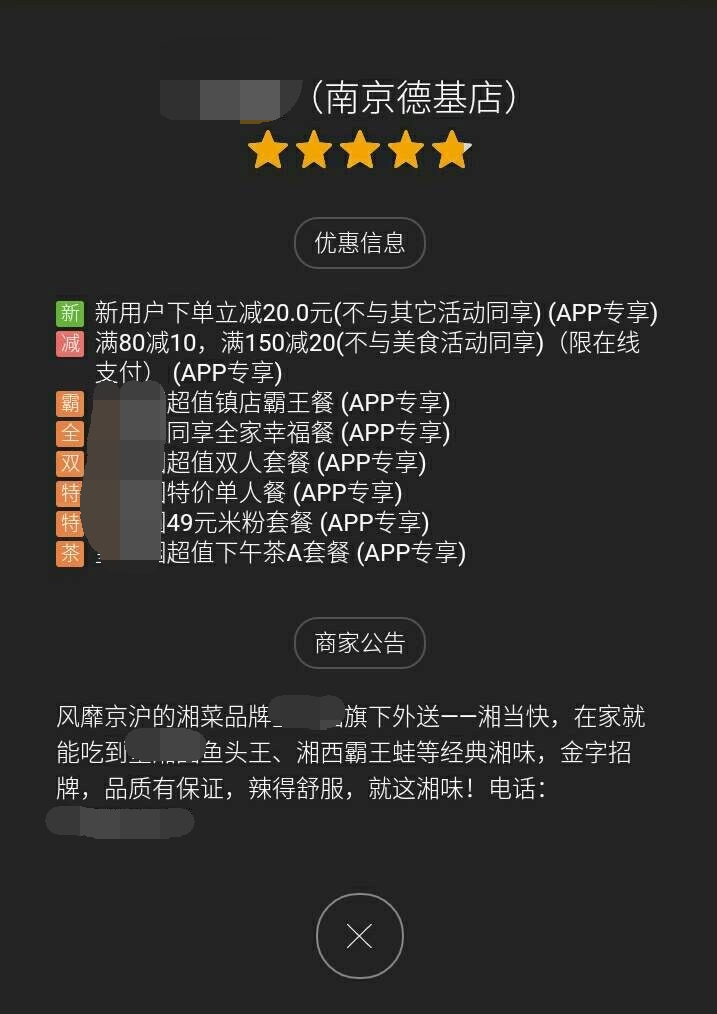
布局要求: 一、内容比较少的时候,关闭按钮要始终在屏幕的下方
二、当「优惠信息和商家公告」变多,关闭按钮会自动被撑下去
如下图gif:
当我第一次碰到这样要求的布局时,说实话,我有点蒙圈。 别着急往下翻,咱们先来思考一下,如何实现?fix?height:100%? 看到要求一的时候,我觉得很简单吗!用fix属性可以轻松实现。看到要求二的时候,我发现我太年轻了,这个根本不可能实现啊?或者说fix属性肯定是不能实现的了。
后来还是找到了一个不错的解决办法:
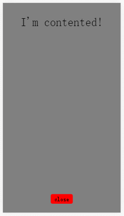
<div class="content-wrapper">
  <div class="content">
    <p>I'm contented!</p>
    <!-- put your html in here -->
  </div>
</div>
<div class="footer">
  <span>close</span>
</div>
html部分准备完毕!
接下来就是css 部分了 首先是全屏显示那么高度100%就避免不了:
html,body{
  margin: 0;
  padding: 0;
  height: 100%;
}
接下来我们把内容区域填充满,使用 min-height属性。 并给一个半透明的背景效果:
.content-wrapper{
  overflow: auto;
  min-height: 100%;
  background-color: rgba(0,0,0,.5);
}
.content-wrapper .content{
  padding-bottom: 64px;
  text-align: center;
}
.footer{
  margin-top: -46px;
  height: 46px;
  width: 100%;
  text-align: center;
}
.footer span{
  padding: 5px 10px;
  background-color: red;
  border-radius: 5px;
}
然后对内容区域(content)进行一个“留白”处理。使用padding-bottom:64px为footer 腾出空间,以免content的内容会被 footer 给覆盖。
最后,给footer一个margin-top负值操作,就可以实现了。
写在后面: 这样的布局还是有点一点瑕疵的!比如:
1、footer div的高度必须固定。
2、content div的padding-bottom值必须根据footer div的高度值修改而修改。
最后放上几个参考网站!
https://css-tricks.com/couple-takes-sticky-footer/
关注公众号
组队学习,一同成长 
扫码添加好友
备注 加群学习 
← css居中 inline-block →